Solving The Sizing Hiccup
Mirror is a fictional clothing brand which has been a successful offline business for many years. In 2019, Mirror decides to step into the online market due to its overwhelming demand. This project involves rebranding and building a responsive website for Mirror.

PROJECT OVERVIEW
The Challenges:The main goal of this project is to redefine Mirror’s branding and establish an e-commerce responsive website to attract people with different tastes.
My Role: Basically, I worked on this project as a UI/UX Designer for the duration of 6 weeks. The screens were designed using Figma and Adobe illustrator. Later, created my prototype using InVision. Finally, used Zeplin to redline and handover my design.
DESIGN THINKING PROCESS

RESEARCH KICK OFF
Initially, I had no idea about how different people shop online. So, I set out to analyze the current and emerging trends for online shopping websites. This was a great start to challenge all my assumptions.
Deliverables: Market Research | Competitive Analysis | User Interview | Empathy Map | Persona | Storyboard
Market Research
I started with market research to gather data on existing online clothing stores and their trends through online resources. This was particularly useful for analyzing the competitors and to create provisional personas based on different generations. Also, I came across a few interesting market statistics:
U.S retail e-commerce sales of apparel and accessories are projected to top $170 billion by 2020.
96% of Americans shop online to save time and avoid crowds.
89% of customers reported visiting websites more often to check out trends and compare prices before making in-store purchases.
Some of the pain points experienced by the users were:
Complicated site navigation
Overwhelming advertisements on websites.
Not being able to try the product.
Competitive Analysis
I decided to proceed with competitor analysis to understand in depth about the target market and existing usability problems. To know the features used by competitors in their website to attract users and to identify a feature that can help enhance the user experience.

User Interview
You cannot understand good design if you do not understand people; design is made for people — Dieter Rams
So then, it was time for me to talk to people to discover their needs, wants and their personal experiences with online shopping. I recruited four participants comprising of open-ended questions to collect qualitative data. They were between the age group of 18-40 years old and had experience shopping online. This helped me to gain a deeper understanding of people’s behavior and their expectations.
Empathy Map
Accordingly, I had my notes and recordings from user interview ready for outlining my empathy map and to organize similar patterns together. This led me to uncover user’s insight which in turn helped me to define their needs.

Insights
Users are frustrated with ordering the wrong size of clothing.
More product filters while shopping was important to users.
Users are frustrated with random recommendations of clothing style.
Needs
Users need to be able to customize the right size.
Users need to be able to find more product filters to different categories.
Users need to know that recommendations are based on their clothing style.
User Persona
So then, I created an engaging persona with all the data gathered from the secondary research findings, user interview and the patterns emerged during empathy mapping. The perspective of persona was to examine the emotions of users and their psychology.

Storyboard
Therefore, I constructed a storyboard combining the emotions, thoughts and frustrations of the Eya (a user) who was afraid of ordering wrong size dress that might not fit her and how Mirror solved her problem.

DEFINE
After completing my research, I organized them to analyze the observations and synthesize them in order to define the core problem identified so far. Finally, focused on defining the problem statements in a human-centered manner.
Deliverables: Project Goals
Project Goals
An overview of business goals along with user goals (through research and analysis) and technical goals.

IDEATE
Finally, I was so excited to come up with new ideas and identify solutions to problems uncovered during define phase.
Deliverables: Card Sorting | Roadmap | Site Map | Task Flow | User Flow | Sketches
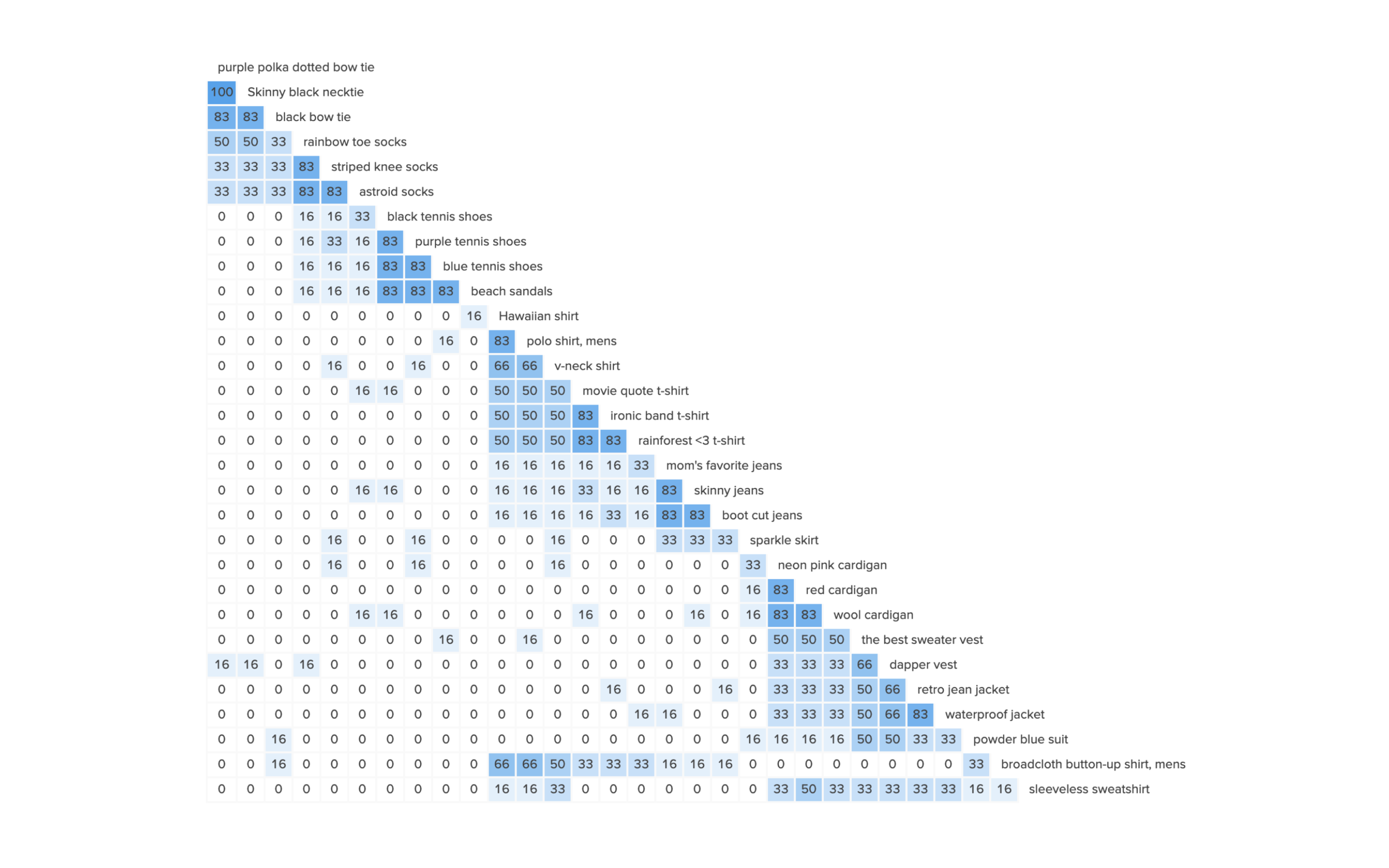
Card Sorting
I began with card sorting with 30 different cards, in order to establish information architecture for Mirror site design.

Sitemap
Next, It was time for me to pre-plan the relationship between the contents on the site.

User Flow
Similarly, I mapped out different paths taken by a user to place an order.

Sketches
In the meantime, quickly sketched few of my ideas while keeping in mind my target audience and their needs.

PROTOTYPE & TESTING
In this phase, I worked on identifying the best possible solutions for the problems identified during the research, define and ideate phase.
Deliverables: Mid-Fidelity Wireframes & Prototype | Branding | High-Fidelity Wireframes & Prototype | Usability Testing | Affinity Map
Responsive Wireframes
With all the ideas and branding in mind, I created responsive layouts for different viewports - Desktop, Tablet and Mobile.

Mid-Fidelity Wireframes
In addition to the layouts designed for responsive wireframes, 26 more screens was designed for mid-fidelity prototype using InVision.

Branding
Mirror required a strong branding that distinguishes it from other clothing brands and makes a memorable impression on users. Mirror brand attributes were elegant, stylish, beautiful, sophisticated, fresh and trendy. Designed a logo according to my brand attributes, elegant and beautiful.

High-Fidelity Wireframes & Prototype
I then converted the mid-fidelity prototype into highly functional and interactive prototype using InVision. High-fidelity prototype are visually appealing and aesthetically pleasing.

Usability Testing
A usability test was conducted with high-fidelity prototype to further understand the pain-points of users and to refine one or more problems. So, I can return to previous stages in the process to make as many iterations as possible.
At the end of testing, all participants were able to complete the tasks with out any error, there were 5 participants of which 3 women and 2 men, between the age of 20-40 years old. All of the participants were online shoppers. The main tasks were:
Find an ocean blue dress and place an order.
Find a blue dress and check if you can find the right size.
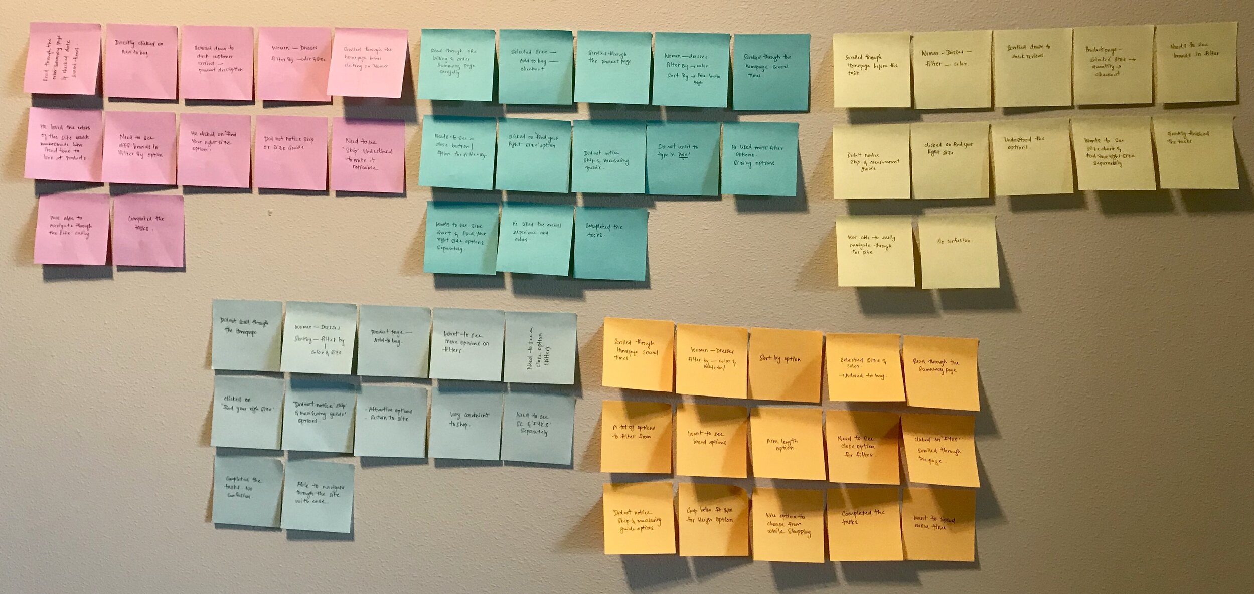
Affinity Map
Similar to empathy mapping, I gathered all my notes and recordings from the interview to outline them. This gave me an overall picture of the emerging patterns which led me to generate insights and later design recommendations based on insights.

Insights
Users were confused between ‘size chart’ and ‘find your right size’ feature.
A ‘close’ icon was important to users while using ‘filter by’ feature.
Users were not able to notice ‘skip’ and ‘measuring guide’ features at the bottom of ‘find your right size’ page.
Design Recommendations
Place ‘size chart away from ‘find your right size’ feature.
Underline ‘size chart’.
Change ‘find your right size’ feature with ‘let us help you’.
Provide ‘filter by’ with a ‘close’ icon.
ITERATIONS & HANDOFF
I then started working on implementing the design recommendations into the design. Several revisions were made before uploading the final revisions.
Deliverables: Iterations | Updated High-Fidelity Prototype I UI Kit
Iterations
During the usability testing with users, I found that the users were looking for options to close the filter by drop-down. So, I added a close icon into the filter by drop-down to make it easier for users to close it as they please. Another pain point was that the ‘size chart’ and ‘find your right size’ placed next to each other, this led to confusion among most of the users. Therefore, in order to make the intention of these features clear to users, it was placed away from each other.

UI Kit
Lastly, documented all the user interface components used throughout the design for future references.

High-Fidelity Prototype
When entering the homepage, the user is provided with a wide range of clothing options for both men and women. So, if a user wants to checkout women clothing, he/she is presented with a drop-down containing variety of options which leads them to different sub-pages based on what they like to shop. Mirror presents users with aesthetically pleasing and user-friendly design. View the prototype to learn more about the site.
Next Steps
Choose a redlining tool and hand over the prototype to a team of developers. For this project, I used Zeplin tool and uploaded my completed prototype to view design specifications. Furthermore, I would conduct more usability testing to identify areas of improvements and update UI kit accordingly.
Takeaways
This being my first ever UX case study, I learnt a lot in each stage of the process. Understanding and implementing design thinking has forever changed my life. The most challenging part was empathizing with the users, understanding their needs and expectations while taking note of every small details because every small details matter.
Meanwhile, I realized that the way I look at things drastically changed, details began to matter more. This project has taught me many things and the most important thing that I learnt was ‘Have no fear of perfection, you will never reach it’.

